


Color Drenching Ideas In 2026: Walls, Ceiling, and Furniture in One Tonal Language
In 2026, interior design will shift away from contrast-driven decoration toward immersive, intentionally designed spaces that feel emotionally grounded.
Homes are no longer styled as visual collages; instead, they are conceived as unified environments that support how people live, rest, and reconnect. Within this evolution, color-drenched ideas will emerge as one of the most defining approaches found in modern interiors.
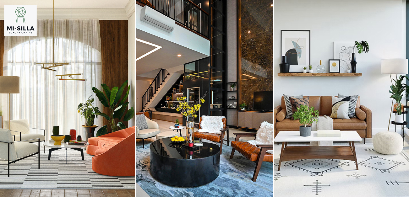
Mi Silla is a design-led upholstery studio and manufacturer, creating made-to-order seating and studio interpretations of iconic design language-customized in upholstery, scale, and detailing for homeowners and the trade.
Color drenching-sometimes described as designing a “colored room” using a single tonal language-goes beyond paint selection. It is a method of shaping mood and perception by carrying one color family across walls, ceilings, and architectural details. Rather than using contrast to define a space, color drenching relies on depth, texture, and proportion.
Homeowners will find this method to be soothing. Color-saturated interiors are simpler to live with. They are perceived to be quiet to the eye and more psychologically cohesive. Designers and architects will appreciate the sophisticated technique of using color drenching to moderate the flow of space.
This guide explores how to apply color-drenching ideas to walls, ceilings, and furniture in 2026, balancing visual clarity, comfort, and longterm relevance.
What Is Color Drenching a Room? Understanding the Concept Beyond the Trend?
Many people ask: What is color drenching a room? At its core, it’s the practice of applying a single color, or closely related shades, across multiple surfaces within a space. This typically includes walls, ceilings, interior trim, and, often, furniture and upholstery.
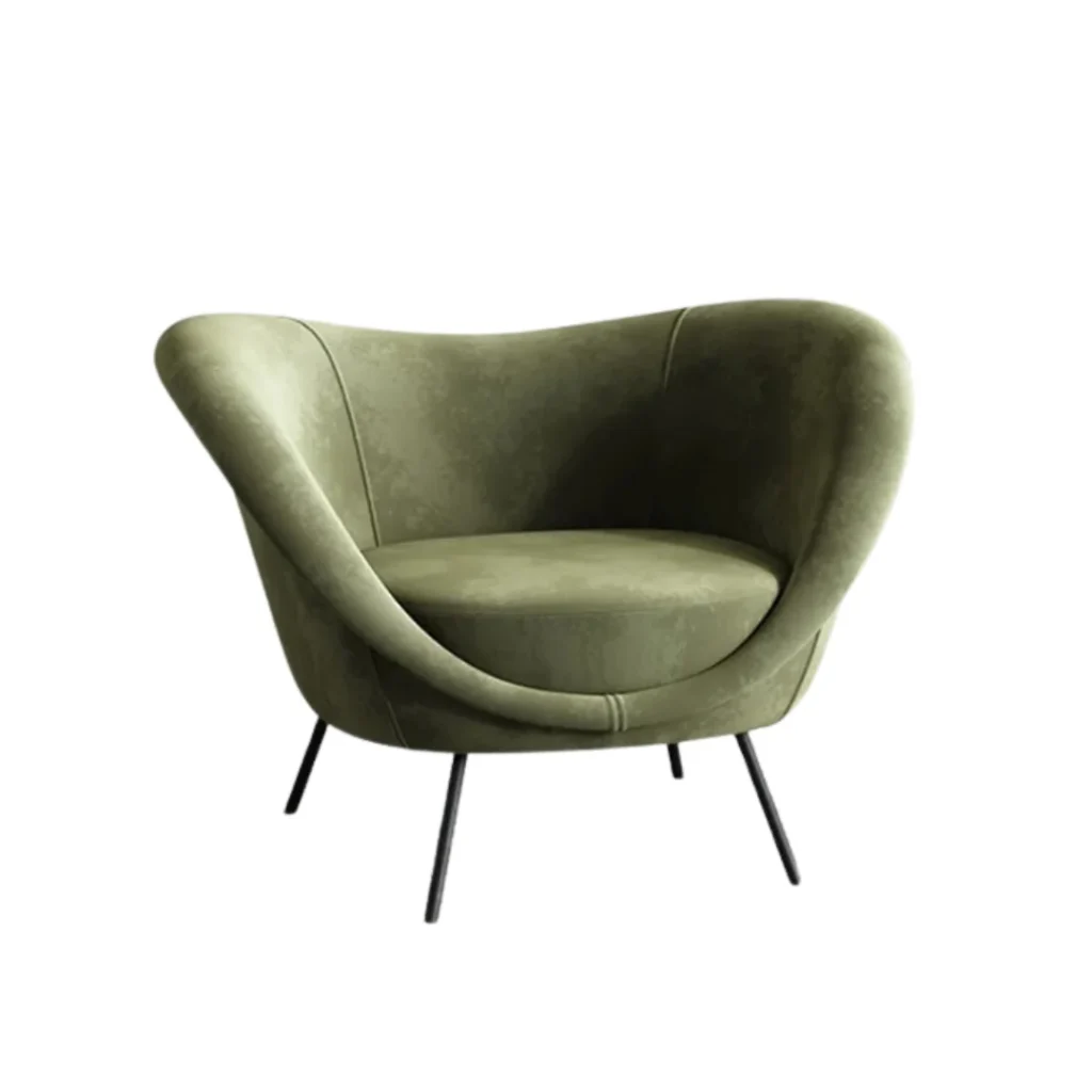
However, effective color drenching is not just painting everything the same shade. It is about tonal harmony across materials and finishes. A matte wall finish may sit alongside a slightly satin ceiling. Furniture, such as a sculptural Luxury Totu Armchair, can be upholstered in related hues without breaking cohesion. By maintaining this dialogue, spaces feel layered and unified rather than flat.
This approach differs from traditional monochromatic design, which can sometimes feel static. Color drenching allows for subtle variation while preserving continuity. It also differs from accent-heavy schemes that rely on contrast to engage the eye. Here, color serves as a backdrop that elevates texture, materials, and form.
In before-and-after projects, fragmented rooms often become visually continuous-supporting flow, proportion, and calm.
A Step-by-Step Color Drenching Process (That Doesn’t Feel Flat)
- Choose a base color family (warm neutral, muted green, dusty blue).
- Map the finishes (matte walls, softer-satin ceiling, consistent trim strategy).
- Test the color in morning vs. evening light before committing.
- Paint the “envelope” first (walls + ceiling + trim/doors if relevant).
- Add texture in the same tonal range (bouclé, linen blends, brushed metals, wood grain).
- Bring furniture into the palette (match, blend, or layer within nearby shades).
- Lock in lighting (directional + ambient) to highlight texture and shape.
What Designers and Architects Should Confirm on Color-Drenched Projects
- Paint plan by surface (walls/ceiling/trim/doors) + sheen schedule for each.
- Sample approvals in the actual site lighting (day + night).
- Material coordination: wood stains, metal finishes, stone undertones (to avoid “off” clashes).
- Upholstery and COM/COL alignment (undertones, dye lots, repeats, directionality).
- Site constraints + timeline: access, protection, staging, lead times for custom pieces.
Why Color Drenching Works So Well in Modern Spaces?
Modern interiors advocate openness, flexibility, and emotional comfort, all of which are made possible by living rooms that can be transformed into multifunctional spaces. Color drenching will support all those three factors by reducing visual noise and enabling the eye to move naturally from one area to another.
In open-plan homes, color drenching can make disparate areas feel unified. For example, a single wall tone that wraps from a living area through to a dining area creates harmony, especially when paired with cohesive furniture choices like the Lido Armchairs in transcendent upholstery. This same principle applies in a color-drenching dining room, where consistency across seating and built-ins encourages seamless connection between spaces.
From a spatial perspective, color drenching subtly shapes perception. Darker tones can make large rooms feel more intimate, while lighter tones visually expand smaller spaces without structural changes. Designers frequently use this technique to refine proportions in multifunctional areas.
Emotionally, consistent color environments tend to support relaxation and focus. Many homeowners describe color-drenched rooms as easier to inhabit, spaces that don’t demand attention but quietly support daily routines and lived experience.
Choosing the Right Base Color: The Foundation of a Tonal Interior
Selecting the right base color is the most critical decision when exploring how to color-drench a room. The chosen hue will determine whether the space feels calm, warm, restorative, or energizing.
Warm neutrals, such as clay, sand, or warm gray, create inviting environments that feel grounded and timeless. These palettes pair seamlessly with furniture like the Billie Armchair, whose plush upholstery adds warmth to a neutral, color-drenched living room. Cool tones, muted blues and soft greens-bring composure and are wellsuited to spaces where tranquility is a priority. Natural light plays a decisive role in color behavior. North-facing rooms often benefit from warmer tones to counteract cooler daylight, while south-facing spaces can support richer, more saturated hues. Practitioners designing small rooms frequently recommend mid-tone palettes that are forgiving and adapt well to varying light conditions.
When considering good colors for a master bedroom or other key spaces, testing tones in different light throughout the day reveals how they interact with both daylight and artificial lighting. This step is significant when working toward color drenching, where uniformity across surfaces is crucial.
Color Drenching Walls: Creating Depth without Contrast
Walls form the largest visual surface in any interior, making them the natural starting point for color drenching. In 2026, designers are favoring matte, eggshell, and softly textured finishes that absorb light and encourage depth. These finishes work exceptionally well in spaces where continuity is key, such as color-drenched living room layouts.
Textured wall finishes, like limewash or subtle plaster, add variation without contrast, allowing the same tone to behave differently throughout the day. The same color behaves differently throughout the day, enriching the palette without disrupting harmony. Extending the same wall color across adjacent rooms enhances spatial continuity, letting architectural forms and furniture relationships define function rather than color transitions. This is particularly effective in fluid living/dining/kitchen zones, where consistent wall color supports flexible layout solutions.
Color Drenching the Ceiling: The Most Overlooked Design Move
Ceilings are often left white or treated as an afterthought, but in color-drenched interiors, they play a defining role. Painting the ceiling in the same tone as the walls removes visual breaks and creates a cohesive sense of enclosure.
In standard-height rooms, an exact match creates calm and intentional spatial presence. In taller rooms, designers sometimes adjust the ceiling tone slightly, lighter to emphasize height or deeper to foster intimacy. This approach can be particularly transformative in compact layouts where subtle shifts in tone help anchor the space.
This works in compact bathrooms as well as larger living areas—once the ceiling matches the walls, the room reads as one cohesive envelope.
Furniture in a Drenched Space: Matching, Blending, or Layering
Furniture selection is one of the most critical considerations once walls and ceilings are finished. Rather than insisting on exact matches, designers look for tonal harmony. Upholstered pieces like the airy Maia Armchair blend naturally with mid-toned walls, creating spaces that feel curated without being contrived.
For a bolder statement in a color-drenched living area, a sculptural piece like the Litho Armchair can add artistic expression while remaining within the tonal family. Similarly, wingback designs, such as the Tori Armchair, introduce subtle architectural interest while maintaining visual continuity.
Wood and metal elements should complement the dominant palette. The goal is harmony, not contrast, allowing materials to enhance the immersive environment.
Texture over Contrast: How to Keep Color-Drenched Rooms Interesting
One of the most common misconceptions about color drenching is that it risks making a space feel flat. Successful color-drenched interiors rely on texture rather than contrast to create visual interest.
Soft upholstery plays a significant role here. Bouclé, linen blends, and subtly woven fabrics catch light differently throughout the day, introducing quiet movement without breaking tonal harmony. An armchair with sculpted upholstery adds depth to a drenched space while remaining visually calm and cohesive.
Natural materials further enrich the environment. Wood grain, stone surfaces, and brushed metals provide tactile contrast even when they sit within the same color family. For example, pairing a Colo drenched wall with a wood framed accent chair finished in a closely matched tone allows material variation—not color—to take visual precedence. Lighting is the final layer. Directional lighting highlights texture and form, creating shadows that shift subtly throughout the day. In a color-drenched living room, this interplay between light and surface prevents the space from feeling static and reinforces its sense of depth and dimension.
Color Drenching Room by Room: Practical Ideas
Living Room
A color-drenched living room is one of the most effective ways to create a calm yet expressive interior. Mid-tone neutrals, muted greens, and warm grays work particularly well in shared spaces where comfort and conversation matter.
Upholstered seating in the same tonal family helps anchor the room. A relaxed lounge chair with generous proportions, like the Lido Armchair, supports everyday use while blending seamlessly into the overall palette. Sculptural accent seating, such as the D.154.2 Armchair, can be introduced sparingly to add architectural interest without disrupting the tonal language.
By keeping the walls, ceiling, and furniture aligned within a single-color family, the living room feels cohesive even when multiple seating zones are present.
Bedroom
A color-drenching bedroom prioritizes rest and emotional comfort. Soft, enveloping tones, such as warm taupe, muted blue, or dusty green, are among the most recommended colors to paint a master bedroom in 2026.
Extending the wall color across the ceiling creates a cocooning effect that promotes relaxation. Upholstered furniture, including bedside seating or a reading chair like the Tulip Armchair, blends naturally into the space while adding both comfort and everyday functionality. These approaches frequently appear in curated bedroom painting color ideas, especially when homeowners want a space that feels serene rather than styled.
Dining Room
A color-drenched dining room creates intimacy without enclosure. Using a single tonal palette across the walls, ceiling, and dining furniture helps the room feel intentional rather than transitional.
Dining chairs upholstered in matching or closely related tones enhance the experience, keeping the focus on conversation and gathering. When paired with subtle material variation, such as wood grain or stone surfaces, the dining area feels layered while maintaining visual restraint.
Bathroom
Color drenching is increasingly popular in bathrooms, especially compact ones. A color-drenched bathroom reduces visual fragmentation by removing contrast between walls, ceiling, and cabinetry.
In a colordrenched small bathroom, midtone palettes work especially well. By extending the same color across surfaces, the space feels larger, calmer, and more unified.
Textured tiles or matte finishes prevent the space from feeling flat while maintaining the tonal language.
Common Mistakes to Avoid with Color Drenching
While color drenching is conceptually simple, execution requires care. One common mistake is choosing a color without considering undertones. Even subtle mismatches can disrupt the intended harmony.
Another frequent misstep is overusing gloss finishes, which can introduce glare and compromise the softness of the palette. Designers also caution against introducing contrast too early, adding bold accessories before the tonal foundation is established, which often undermines the effect.
Successful color drenching depends on testing, patience, and restraint.
Why Custom Furniture Matters in Color-Drenched Interiors?
Color-drenched spaces demand precision, something off-the-shelf furniture often struggles to deliver. Custom furniture allows designers and homeowners to control upholstery color, material texture, and proportions so each piece integrates seamlessly into the environment.
- Exact upholstery color matching: undertone control, dye-lot consistency, and tonal layering.
- Material selection: velvet vs. performance fabric vs. leather, plus texture that supports the palette.
- Proportions: seat depth/height, scale for open-plan layouts, apartment-scale options.
- Finishes: wood stain and metal tone matched to the base color family.
- For the trade: COM/COL, spec sheets, lead times, and project coordination.
An armchair upholstered in a tone that aligns perfectly with the wall color, such as a tailored version of the Billie Armchair, feels intentional rather than added. Custom finishes also ensure wood tones, metal accents, and upholstery undertones work together cohesively.
Beyond aesthetics, custom furniture supports long-term performance.
Durable fabrics, thoughtfully scaled dimensions, and adaptable finishes allow furniture to evolve with the space rather than restrict future design changes.
Designing with Confidence: Color Drenching as a Long-Term Choice
Color drenching is not a fleeting trend; it reflects how interiors are being designed for longevity. By relying on tonal harmony instead of contrast, these spaces age gracefully and adapt easily over time.
As tastes evolve, texture, lighting, and furniture can be updated without reworking the entire palette. This flexibility makes color drenching a brilliant choice for homeowners seeking durability and for designers working on long-term residential projects.
At Mi Silla, this philosophy is reflected in both design and craftsmanship. Through custom upholstery, refined silhouettes, and material expertise, we support interiors where furniture integrates seamlessly into its surroundings. Rather than standing apart, each piece contributes to a unified design story, helping color-drenched spaces feel complete, enduring, and truly lived in.